Where Every Scroll is a New Adventure
Art Tutorial - Blog Posts
A certain person asked me how I paint with watercolors so I guess I'm going to tell you all! Now I'm not professionally trained, I just learned what I know from experimenting, asking questions, and looking up tutorials. So this may not be what the experts do, but it's what works for me.
How I paint:
Materials: I have a watercolor palette, a little jar full of water, my paint brushes, some paper that is thick enough for watercolors, pencil, and some paper towel to help mop up excess water. I always put down some kind of rag cloth or newspapers down on the table first so I don't get any paint on the table. Watercolors don't stain as much as other kinds of paint but it's best to you be careful.
I always use a watercolor palette to make my paintings. This is a very different system from oil paint or acrylic paints or even liquid watercolors or watercolor pencils, so you need to keep that in mind with the rest of the things I tell you

Step 1 (Start): I decide what I'm going to paint and make a little pencil sketch of it on the paper, It doesn't need to be detailed it just needs to give me a rough idea on how big it will be and where various shapes will go. (I sketch it very light so that you don't see the pencil lines on the finished painting but you can make it dark if you still want to see the lines).

Step 2 (Layers 🧅): I decide which colours would be best to be put on the bottom layer and which colours should be put on the top layer and then begin painting accordingly. For example I painted Mirabel's skin before I painted her hair, so I could have bits of her hair going down on top of her skin. I mix the colours together on a scrap piece of paper first just to test how they look.

Step 3 (How to apply paint): I dip my paint brush in water and then swirl it around in the needed colour until I have my desired amount, then I begin to paint in the shape that I want. Whenever my brush needs more colour I put a very small amount of water on it and then rub it gently against the paint palette then brush it again on the paper. For dark colours I swirl it around longer in the paint to get more paint on it and then lay it on thick. For lighter colours I put more water on the brush and less paint on it and then use the water to spread the paint even further across the paper. Important tip: Never press your brush too hard against the paint palette or the paper when you're painting, otherwise the bristles could be bent out of shape or fall out. Use the same amount of pressure you'd use if you were petting a kitten with the paintbrush. (You shouldn't actually do that, it's just a metaphor.)
Important tip: If you ever have too much water on your paintbrush, use a paper towel to mop some of it up. You can also use a paper towel to help get unwanted paint off your brushes.

Step 4 (Waiting): After filling in one shape with a specific colour, I move on to the next colour. If I don't want the colours to mix together I wait a minute or two for the first part to dry before I continue on to the next part. But if I do want a gradient then I start adding the new colour and brush them together a bit with water.

Step 5 (Small details): Watercolours mix together really well but that means to get good looking light colours you have to apply them directly to the paper, where there isn't any paint, otherwise if they are mixed with a dark-colour they could become muddy looking. For things like Mirabelle's glasses I painted the skin around them first, leaving a white blank space and then once the paint had dried I very carefully added the light green, making sure not to get the brown paint wet again. (I also use this process for the butterfly on the accordion and the earring.)

Step 6 (Optional Final touches): Sometimes I used paint for the pupils of eyes but they never seem as detailed as I want. So instead what I do is I leave the eyes as blank white circles, and then once I'm finished painting everything else, and everything is completely dry, I use a small pen or marker to draw the black outline around the eyes as well as pupils and pencil crayons to colour the iris. I also use pencil crayons for the eyebrows, lips and dress butterflies.

Repeating these steps for a very long time eventually leads to a finished painting. If you have any questions let me know.


Image one has delicate lineart that while it shows varying degrees of pressure, the characters are overlapped in a way where they are too homogenous. My solution to this issue is to clearly define each character with a uniform outline running along the very outside edge of the character while adjusting inner outlines as needed to unify the appearance of the outlines overall.
If you are using color to complete your image, image one is fine enough for that because the colors will make the characters stand out as long as the palettes are different enough. However when we are working in screentones / monochrome, a thicker outline provides more clarity amongst the dots and lines.
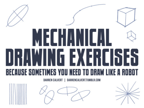


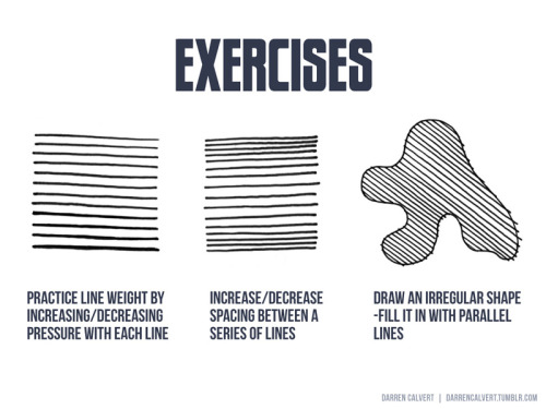


People often say to me: “You draw like some kind of inhuman machine. If I eat your brain, will I gain your power?” The answer is yes, but there is another way. The key to precise drawing is building up muscle memory so that your arm/hand/fingers do the things you want them to do when you want them to do them. Teaching yourself to draw a straight line or to make sweet curves is just a matter of practice and there are some exercises you can do to help improve. If you’re going to be doodling in class or during meetings anyway, why not put that time to good use?


what it says on the tin! I offered to throw together something on drawing raw meat (in a mouthwashing server, naturally) so here it is in case someone finds it useful
The Exotic Animal Photo Reference Repository is live!
You can find it at: https://www.animal-photo-references.com!

Here's how this repository works: all photos were taken by me, a human, at zoos, aquariums, sanctuaries, and other facilities with animals in human care. There is no AI involved in the photo editing or creation and there never will be. Right now there's 56 species on the site; my catalog has over 300 and I will be uploading the rest of them as fast as I can.
Artists creating derivative or transformative works (without AI) have blanket permission to use these references. Yes, even for work you're going to sell.
All other usage/reproduction requires permission, but assume I'm friendly and please do ask! That's educators, researchers, the media, people who need images for a school presentation, etc. This is just to retain copyright/control in case they're scraped/reused unethically - it doesn't meant I don't want folk to have access! So please do reach out via the contact form on the repository website, I don't bite and I'm most likely going to say yes.
Please don't repost the repository photos to your own blogs: I've created @animalphotorefs as a dedicated blog to share photos from the site, and of course I'll reblog a lot of it here! That again just helps with retaining copyright and sourcing of the images. If you really want to repost some for a specific purpose, please just ask me first!
Also, folks, this project has no funding. It's just me and my camera.
There will never be a paywall on the site - I believe resources like this absolutely must be free for everyone to access. So please, please, please support the repository if you use it. Want sneak peeks at photos, cute videos I take, or to help choose what I photograph and what gets posted first? You can do that through Patreon (and there's a free trial on the most interactive tier!) If you'd like to just drop a tip, I've also set up a Ko-Fi.
I can't wait to hear what everyone thinks of the repository.
To whet your thirst for cute photos, here's an Indian rhinoceros contemplating a goose.


Notes on painting portraits with saturated color and early access to a new piece up on Patreon! 💫


Drawing one or two leaves is manageable, but drawing a whole cluster of them is a different challenge altogether! I created a tutorial about conveying dense details, like foliage, quickly and efficiently - here’s a snippet from that video ✨
You can watch the full tutorial over on my Patreon! It's my latest tutorial which means that it's available for just $5 - next month it will go into the backlog which costs $10 to access. If you want this tutorial for $5, make sure you sign up this month!
how r you so good at drawing (halo) armor. You’re literally one of the best I’ve ever seen. Tips please if possible? (specifically for the shapes of the armor)
Oh god heLLO; I'm super bad at explaining my process of drawing RvB armor, as it's been multiple years since I've done it up until recently, so I'm super rusty but I will do my best to explain myself!!!
I've never made any sort of tip guide or tutorial, so please bear with me!

USE REFERENCES!!! This can go for renders from the Halo games directly (ArtStation was a great place to start, I'm not sure how things are post AI ""art"" surge, though) but at the very least, screenshot the heCK out of the series from whatever season you want to draw. There are a lot of different angles, and after they started to animate, it made it easier to get references with arms up or splayed out to the sides, or legs bent and hand motions!! Depends on what you're looking for!!

For this Reference, I used a Halo 3 render, as well as the Caboose-isms poster render. There are more clear renders out there, I'm sure!
First step that I take in learning to draw a new set of armor is color coding the sections that I'm going to draw, and then labeling them with points of interest that make me remember the detail later; Like grooves, or a bevel that looks weird or silly. Color coding and labelling the parts made it easier for me to break it down into smaller bits to draw piece by piece, bc let's face it; Armor can be super tedious and daunting, especially if you're just starting out.
Remember It's ALL SHAPES!!! IT'S JUST SHAPES!!!! Break them down into more simple shapes to find what works best for you! Keep it loose in the sketch stage, so you don't get lost in the pesky details

Remember that the armor goes on TOP of a body, and isn't a part of their body! Halo Infinite dOES have prosthetics that are a bit smaller than the armor, which adds depth and flavor to your armor though!
When in doubt, draw it larger than you mean to, and size it down to fit your other pieces!

SIMPLIFY IT!!! TRACE TO LEARN!!!! Really just figure out where the pieces go and put them together like a puzzle! Armor is simply just, hard, and there's no easy way to learn quickly how to do it efficiently and well; It really does take a lot of practice and trying and sketching and watching clips and staring at other's art to maybe notice shortcuts or even details you didn't notice before!!
But the biggest tip that I can give you is just, don't be afraid to make "bad art" don't be afraid to draw "bad armor" !!! It doesn't have to be perfect, the details don't all have to align on model 100% of the time! All of my art, paintings and all, have things that I fudged or missed, or messed up on and didn't notice, but I still have fun painting and drawing because I like making people laugh with my comics and I like having them feel stuff about my paintings!
Sorry if this wasn't what you were looking for, but I hope this helps even just a little bit!!


Weekly art tip: Drawing folds!
Hope you guys enjoy it I’ve put a lot work to make this ^^
I tried to make it as simple as possible :)


I made an art/anatomy tutorial about birds! I hope people will find it helpful!


HANDS POINTING from the How to THINK when you Draw ENCYCLOPEDIA - the world’s ONLY encyclopedia of drawing tutorials , all of which is FREE for EVERYONE, FOREVER - and I post LOADS of DIFFERENT tutorials EVERY DAY on OUR MASSIVE INSTAGRAM HERE and OUR GIANT TWITTER HERE and on TIKTOK HERE !
PLUS! CLICK HERE for 300 EXTRA FREE TUTORIALS!
Lorenzo!

Sorry if this is a silly question but how do you get that glowy look for colours in your art?? It looks so cool and pretty
Hi! Not a silly question at all! I'll use this drawing that has a transparent white canvas background as an example. Here it's fully colored and without any effects.

When I'm ready to export as a PNG, I merge all the layers into one and then duplicate that one layer.

This is where the effects happen. On that duplicate layer, I use gaussian blur to begin. Usually I go for somewhere between 5 and 10.

Then, again on that blurred layer, I change the layer mode. Typically I'll do multiply, overlay, shade, or shade/shine.

Here I pick overlay.

I usually adjust the opacity to my liking during this stage as well. In this case I set to 60%.

You can also see there is a "glow" around him. Sometimes, if I don't want this "glow", I'll clip the layer to remove it.

And that's essentially it! I use Paint Tool SAI as my drawing app, but I know different apps have different blur and layer mode options that you can experiment with 😊
This is definitely one of my fav things to do with my drawings. It can really make it so much more appealing to look at in the end...
Quick little video tutorial! This is a method I use to block in shapes when I’m fighting the urge to polish my lineart at an early stage, especially in rough concept art that doesn’t actually need polished lineart.
I group two layers in photoshop—a rough sketch, and a flat color—and then carve out the negative space by painting into a mask on the group, instead of filling in the positive shapes. From there I can start painting and adding shading into that group, knowing that I’ve already locked down a good initial silhouette for the object/character:

It feels like oil painting, and I end up finding silhouettes/shapes in a way I wouldn’t if I was obsessively cleaning up the linework first. Digital art has a tendency to veer towards cleanliness/polish, so I love finding little opportunities for happy accidents and a bit of mess!
I used it on my unicorn piece last month, for instance, which I think would have lost a lot of its dynamism and charm if I had worried too much about doing a full ink pass:

Hope this is at all helpful! It’s not a method I use 100% of the time, but it really helps move my process along when I do need it 👍🏼
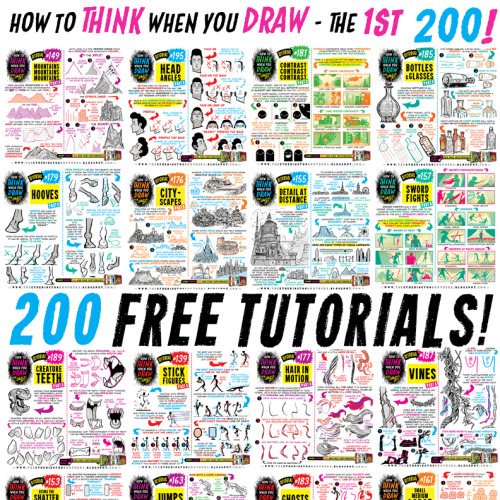
The ONLY WAY to combat the lack of funding in arts education is for professionals to take a few hours a week to share their skills for FREE, to empower and encourage the next generation of artists. THIS IS WHAT THE INTERNET IS FOR. Here’s 200 tutorials:
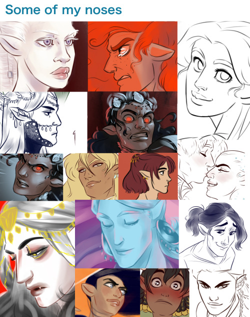
How to draw ANGRY EXPRESSIONS How to draw BATTLE DAMAGE How to draw BIRD HEADS How to draw BOOKS How to draw BOTTLES and GLASSES How to draw BOXES How to draw BREAKING GLASS How to draw BRICKWORK How to draw CABLES and WIRES How to draw CAR CHASES How to draw CATERPILLAR TRACKS How to draw CAVES How to draw CHARACTERS (3-SHAPES) How to draw CHARACTERS (FLIPPED-SHAPES) How to draw CHARACTER SHAPES How to draw CITYSCAPES How to draw COMIC COVERS How to draw COMPOSITION How to draw CONTRAST How to draw CONVERSATIONS How to draw CREATURE TEETH How to draw CROSS-CONTOURS How to draw DETAIL AT DISTANCE How to draw EARS How to draw FABRIC How to draw FEET & SHOES How to draw FEMALE HANDS PART ONE How to draw FEMALE HANDS PART TWO How to draw FLAGS How to draw FOOD TRUCKS How to draw FOREGROUND MIDGROUND BACKGROUND How to draw GAME BUILDINGS How to draw GEMS and CRYSTALS How to draw GHOSTS How to draw GIRL’S HAIR How to draw GOLD How to draw GRASS How to draw HAIR (1940s styles) How to draw HAIR IN MOTION How to draw HAPPY EXPRESSIONS How to draw HEAD ANGLES How to draw HOOVES How to draw HORNS How to draw HORSE HEADS How to draw IMPACT DEBRIS How to draw IN 3D How to draw INTEGRATING LOGOS How to draw INTERIOR BASICS How to draw IN-WORLD TYPOGRAPHY How to draw JUMPS How to draw JUNGLE PLANT CLUSTERS How to draw JUNK HOUSES How to draw LAMP POSTS How to draw LAVA How to draw LIGHTNING and ELECTRICITY How to draw MECHANICAL DETAILS How to draw MUSHROOMS and FUNGUS How to draw MONSTER HEADS How to draw MONSTER TENTACLES How to draw MONSTER TRUCKS How to draw MOUNTAINS How to draw NEGATIVE SPACE How to draw NEWSPAPERS How to draw NOSES How to draw OVERGROWN VEGETATION How to draw PEBBLES AND GRAVEL How to draw PERSPECTIVE BOXES How to draw PIGS How to draw PILLOWS and CUSHIONS How to draw POD HOUSES How to draw POURING LIQUID How to draw ROBOT ARMS How to draw ROCK FORMATIONS How to draw RUNNING FIGURES How to draw SAND How to draw SAUSAGE DOGS How to draw SEA WEED How to draw SHADOW COMPOSITION How to draw SHOULDER ARMOUR How to draw SIEGE WEAPONS How to draw SILHOUETTE THUMBNAILS How to draw SMALL FLAMES How to draw SMALL, MEDIUM, LARGE How to draw SMOKE EFFECTS How to draw SNOW How to draw SPACE BIKES How to draw SQUIRRELS How to draw STICK FIGURES How to draw SWORD FIGHTS How to draw THE HORIZON How to draw TIKI STATUES How to draw TREASURE CHESTS How to draw TREE BARK How to draw TREE ROOTS How to draw USING THE SHATTER TECHNIQUE How to draw VEHICLE STANCE How to draw VINES How to draw VINTAGE PLANES How to draw WATER How to draw WOODEN HOUSES
Since some wanted a tutorial on how I draw the characters, and I needed to make an updated version anyway, I give you:

Weiterlesen
Art Help

I redid this list because broken links 💀
General Tips
Stretch your fingers and hands
Art is for fun
Never too late to start/improve
Tumblr radar! Submit your work!?
Using a tablet
Editing software: pictures & video
Moodboard resources
Comic pacing
Storyboarding techniques
Watercolor
Coloring
Color Theory (not children's hospital)
Resources: coloring things a different color
Gold
Dark Skin undertones
Dark Skin in pastel art
POC Blush tones
Eyes colors
Cohesive Color Palette
Lights and Colors
Human Anatomy
POSE REFERENCES
Eyes: pupil shape, direction
Wizard Battle poses
Romance poses
Shoulders
Tips for practicing anatomy
Proportional Limbs
Skeletons
Hair Directions
Afro, 4C hair
Cane use
Dingle dongles: male reproductive
Clothing
Long skirts
Traditional Chinese Hanfu (clothing reference)
Cultural clothes
CLOTHING REFERENCE
Medieval armor
Sewing information
Animals
Horse -> Dragon
Snouts: dogs, cats, wolves, fox
Foot, paw, hoof
Plants
Blossoms: cherry, plum, apricot, etc
Plants/flowers: North America, Hawaii, Patagonia
More
Drawing references sources
Art tutorial Masterlist
Another art tutorial Masterlist
Inspiration: father recreates son's art
Inspiration: Lights
ART BOOKS
Art Cheats


An illustration of my original characters for a personal project


A friend asked me about my coloring so I made a little guide that I would also like to share with you! So I leave this little thread (eng/esp)


UMBURGRR!!!!!!!!!!!! PLEASE DRAW A DOODLE OF RIDDLE ROSEHEARTS AND MY LIFE, IS YOURS.
OKAY but fr though your art is so MAJESTIC!!!!???!! I swear it has this aura that makes it so compelling, the way you color and render makes all of your works so appealing to the eye and your style is genuinely just AMAZING!!!!!! (if you don’t mind, what art program and brushes do you use??) anyways sorry for talking so much THANK YOU SO MUCH AND HAVE A GREAT REST OF YOUR DAY!!!!!!
GIGGLING right now you're too kind 😭❤️ but honestly, thank you so much it means so much to me (i cry) and ofc! here's my brushes, program, and process 😎 (ft. mr riddle rosehearts)
For my art program I use procreate with a canvas of 300 dpi and for brushes I use kraymer's hard brushes on gumroad !!
Anndd here's how I apply them:


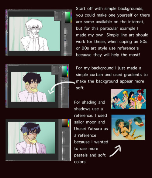
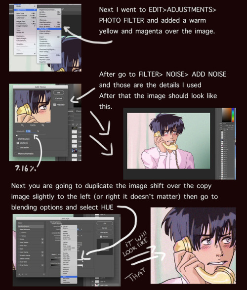
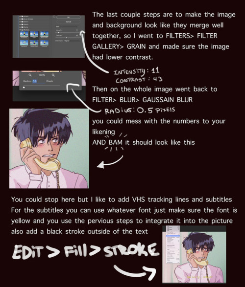
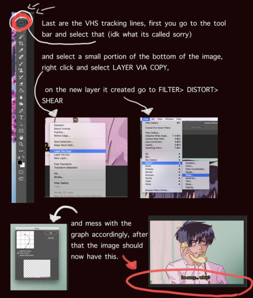
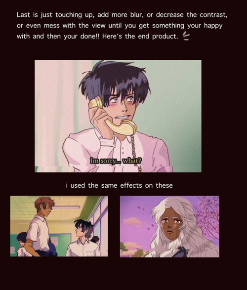
I got a lot of asks about this so I made a tutorial on how I was able to emulate the 80s aesthetic, please keep in mind I’m not an expert and what I put here is just what I personally did. I hope you guys like it and hope it helps
go crazy kids


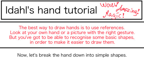
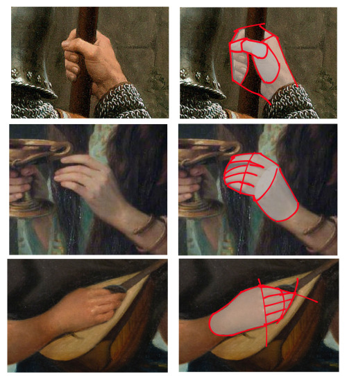
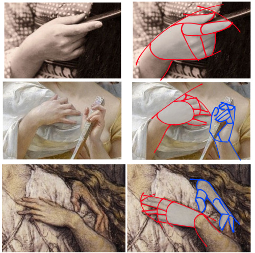
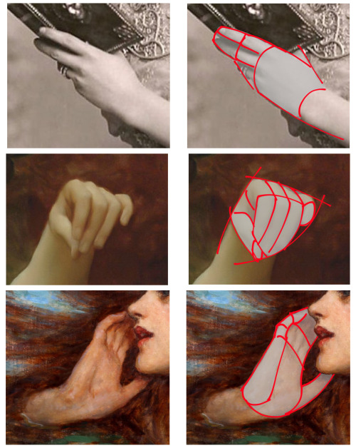
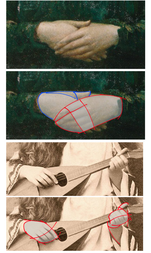

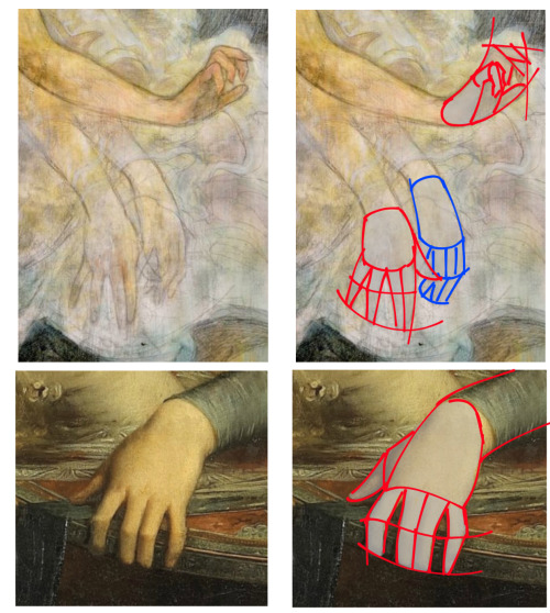
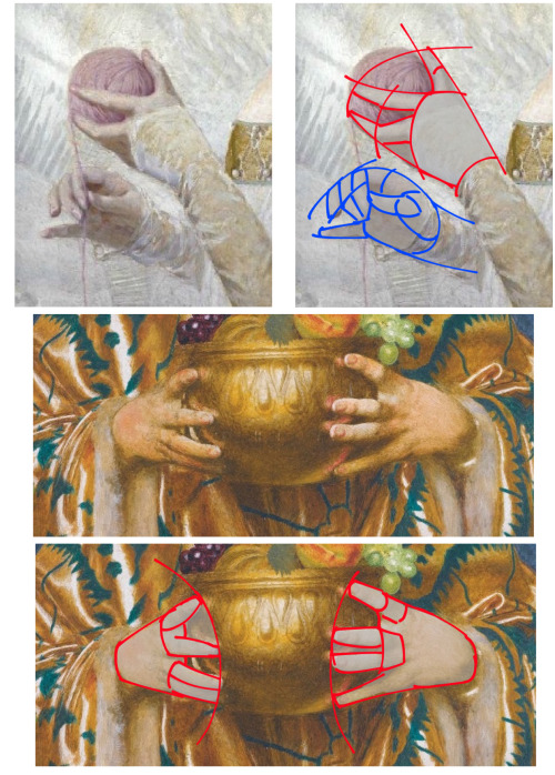
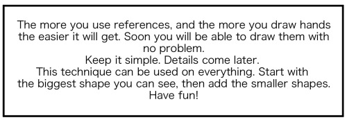
This is how I draw hands. I simplify the shape and then later I will add the necessary details. It makes it easier to get them right. But the only way to learn how to draw hands is to just keep drawing them.


Overview of some topics when it comes to drawing characters who are burn survivors.
DISCLAIMER. Please keep in mind that this is an introductory overview for drawing some burn scars and has a lot of generalizations in it, so not every “X is Z” statement will be true for Actual People. I'm calling this introductory because I hope to get people to actually do their own research before drawing disabled & visibly different characters rather than just making stuff up. Think of it as a starting point and take it with a grain of salt (especially if you have a very different art style from mine).
Talking about research and learning... don't make your burn survivor characters evil. Burn survivors are normal people and don't deserve to be constantly portrayed in such a way.

edit: apparently tum "queerest place on the internet" blr hates disabled people so much that this post got automatically filtered. cool!