Ultraeyepiss - Evil Qorn Mines

More Posts from Ultraeyepiss and Others


Tips and Tricks for krita (part two electric boogaloo)
Ok so this one is going to be a doozy because im going to include a lot of examples and tips for how to use filters (AKA YOUR NEW BEST FRIEND)
Link to part one.
Ok so filters in krita can be a doozy so ill cover the ones i use in my art the most, these will be adjust, artistic, and enhance dropdowns. I will be using my art pieces to show how i modify my art- colourwise!

Obviously, start off with opening the filter menu up. Color balance brings you to this menu, where you can play around with the colour of your shadows, your midtones, and higlights. Its a lot of trial and error, just messing around to see what fits, and its how i got to this point. through just pushing the dials up and down. Honestly, a lot of this part of the tutorial is going to be me telling you to hit those dials and levers like you dont know nobody.


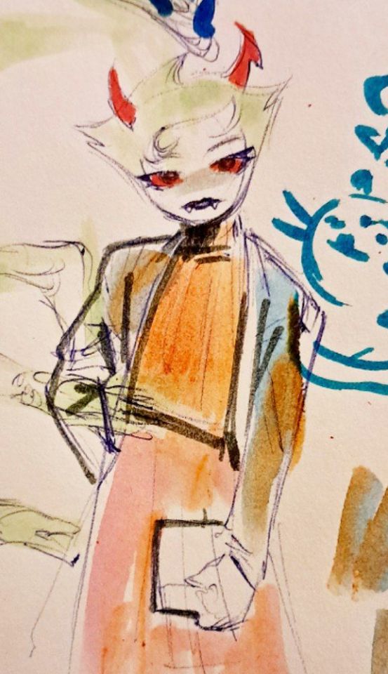
Even just small modifications as you can see can play so much of a difference. For here, i upped the cool tones for john, and upped the warm ones for dave. Colour theory without colour theorising i suppose you could say.
Crosschannel adjustment curves can help with contrast and colour intensity. Usually i have one point which i use to move up and down per my whims to control how bright my work is, and it can really help with really bringing out those colours so it doesnt all fall into one hue. Colour adjustment curves works similiarly, play around with them to get the desired effect.


Krita also has HSV adjustment, but i usually use just the hue and saturation. Theyre pretty self explanatory, and can switch up your palette in pretty fun ways.


Now we move on to the ARTISTIC part. Again, i recommend you play around with them yourself, but i find index colours works really well for making really pretty art really fast! You just put in a few colours with descending lightest to darkest and you get an awesome art piece! Id say this is useful for pixel artists, but also useful for other parties. I might just start using this more myself. Its so easy wtf.


AND FINALLY THE MOST IMPORTANT THING.
HOW MY ART IS SO CRUNCHY.
If youve been following me for a while you probably noticed theres a slight crunch to my art. It gives it a slight bit of texture and makes it noticable. How do i do it?


You're welcome.
insert image of face on 90% opacity and comedic text for purpose.
Alternatively, if youre looking for a sbahj level of crunchiness, smack that "mean removal"for some fun.


Thats all! Happy drawing.

Koroshiya 1, Ichi the Killer, Koroshiya Ichi, 杀手阿1, 殺し屋1 by Yamamoto hideo.


Hi if youve seen these two posts on your timeline please stop for a second.
Ive been living in a bad situation for a while, i cant do my laundry, i cant do my cooking, and i cant use the livingroom. Im confined to my room unless i plan to go outside and there is a set of rules i have to follow where if i leave any small mess i will be yelled at.
Following a disagreement where they demanded to speak to me at 11 pm and i refused due to having college tomorrow and knowing i would probably be verbally berated to the point of breakdown, they broke into my room and things escalated. They are kicking me out and i have to pack tonight and leave tomorrow. I cant do anything abt the living arrangement due to it being an unofficial contract. (They were a family friend that offered to house me.)
If youve seen these posts please consider supporting me on kofi or on patreon. I dont know where else to go.


stroking my bram til i edraculate


sorry i didnt have the appropriate colors... im just so excited abt this new huge sketchbook !!!!
REMEMBER TOMORROW IS A BLACKOUT FOR PALESTINE. DO NOT POST ANYTHING BUT SUPPORT FOR GAZA ON MARCH SECOND. YOUR INTRESTS CAN WAIT, THEY CANNOT.

and remember to do your daily clicks!
-
 manyofnine liked this · 3 weeks ago
 -
 limelimelimelimelime liked this · 3 months ago
 -
 lurker-at-thresholds liked this · 3 months ago
 -
 doofydoop liked this · 3 months ago
 -
 peachrabbit liked this · 4 months ago
 -
 blackcatcorvid reblogged this · 5 months ago
 -
 pigeonsnatcher liked this · 5 months ago
 -
 farewell-to-heart reblogged this · 5 months ago
 -
 who-are-we-to-change liked this · 5 months ago
 -
 selfmaderibcageman liked this · 5 months ago
 -
 xlrcoil reblogged this · 5 months ago
 -
 afriendfromanotherworld liked this · 5 months ago
 -
 eggerz2001 liked this · 5 months ago
 -
 fy0cat liked this · 5 months ago
 -
 dirkkhal liked this · 6 months ago
 -
 desicrave liked this · 6 months ago
 -
 trashieeeww liked this · 6 months ago
 -
 vault-of-crows liked this · 6 months ago
 -
 gun2h0w liked this · 6 months ago
 -
 mxrtified777 liked this · 6 months ago
 -
 witheredhare liked this · 6 months ago
 -
 quantumqueez reblogged this · 6 months ago
 -
quantumqueez liked this · 6 months ago
-
 rowdycowboyrats liked this · 7 months ago
 -
 cherriees liked this · 7 months ago
 -
 bungerisme liked this · 7 months ago
 -
 loverofdeathx liked this · 7 months ago
 -
 absurdlemonfins liked this · 7 months ago
 -
 xxsomedudexx liked this · 7 months ago
 -
 tentabulge-torturechamber liked this · 7 months ago
 -
 rockosmidlife reblogged this · 7 months ago
 -
rockosmidlife liked this · 7 months ago
-
 festeringstatic liked this · 7 months ago
 -
 blognameldk reblogged this · 7 months ago
 -
 misanthropyvsme liked this · 7 months ago
 -
 hornedheresy liked this · 7 months ago
 -
 urf4vvamp liked this · 7 months ago
 -
 burningchttos reblogged this · 7 months ago
 -
burningchttos liked this · 7 months ago
-
 embalment liked this · 7 months ago
 -
 sabasia-blog liked this · 7 months ago
 -
 kivsyak682 liked this · 8 months ago
 -
 lemonjazz liked this · 9 months ago
 -
 greaserink liked this · 9 months ago
 -
 kenthegoose liked this · 9 months ago
 -
 unicornflavorvapejuice reblogged this · 9 months ago
 -
unicornflavorvapejuice liked this · 9 months ago
-
 fishyglubbing liked this · 9 months ago
 -
 noneroticist liked this · 9 months ago
 -
 gutzzxox liked this · 9 months ago
