THE LAYERS CHEAT SHEET PART TWO (PART ONE HERE) Once Again, I’m No Expert- There Are Things About These

THE LAYERS CHEAT SHEET PART TWO (PART ONE HERE) Once again, I’m no expert- there are things about these layers I probably haven’t covered, so please try them out for yourself! Layers 1-7 help your contrast. They are usually a pair of the former two groups I went over in my last post. 1. OVERLAY: Helps your contrast by boosting your lights and darks, while the more mid tone pixels aren’t affected as much. It does this based on the layers beneath it. “Screens” the lights, “multiplies” the darks. 2. SOFT LIGHT: Similar to overlay, but a “softer” effect. You can think of soft light as more transparent. 3. HARD LIGHT: You can look at hard light as an intense version of overlay, with much brighter colors and a much less transparent look. 4. VIVID LIGHT: This is the heavy metal version of overlay- think of it similar to color dodge and color burn. Very intense colors, good for finding interesting lighting and color combos. 5. LINEAR LIGHT: Crazy amounts of contrast and color is added here, even more than vivid light. so heavy metal 6. PIN LIGHT: This one is interesting because besides it also being an intense contrast layer, it can add random noise to the active layer. Apparently this is a combo of the lighten blend mode on the light pixels and darken on the dark pixels, but the noise effect is what makes it really interesting imo. 7. HARD MIX: You will turn this mode on and be like “no” but it is actually adjusting its fill will reveal another overlay-ish type layer. It throws the colors on the active layer towards a more primary color such as blue, or magenta. _____ 8. DIFFERENCE: This will invert your colors, taking into account the layers below. If colors are very close, they will be black. 9. EXCLUSION: This also inverts your colors, taking into account the layers below. If colors are very close, they are grey. Exclusion and difference are layers that would be good for graphic pieces, I haven’t really gotten used to incorporating them in my painting workflow. 10. SUBTRACT: Similar to the above layers, but more intense. You will notice that the darker you make your active layer with Difference, exclusion, and subtract, the lighter and more transparent looking the result will be. 11. DIVIDE: Divide, however, usually results in crazy highlights that are pretty opaque unless the layer is fairly light, and then it will begin to go transparent. ___ 12. HUE: Makes the lower layer take on the hue of the active layer. 13. SATURATION: The lower layers take on the saturation of the active layer. 14. COLOR: The lower layers take on the color of the active layer. 15. LUMINOSITY: The lower layers take on the luminosity, or brightness, of the active layer. Once again, I’m no expert, but I hope this helps. Thanks guys! http://drawmaevedraw.tumblr.com/
More Posts from Arttuti and Others


Step-by-step by Joana Neves
Due to popular demand, I am sharing a step-by-step on how I render faces (though in this case I rendered a whole bust, with a focus on the face). I don’t believe this qualifies as a tutorial, but hopefully it will allow you to roughly understand how I draw and render things, and maybe help you a little bit. Remember that everyone has a different way to work, and what works for me may not work for you and that’s exactly why I wouldn’t call this a tutorial.
I am thinking of doing a similar one for faces with makeup, but I can’t tell exactly when. Anyway, if anyone is interested in that, I will be glad to know! Share your thoughts with me.
I hope you like this and as usual, thank you for the support!


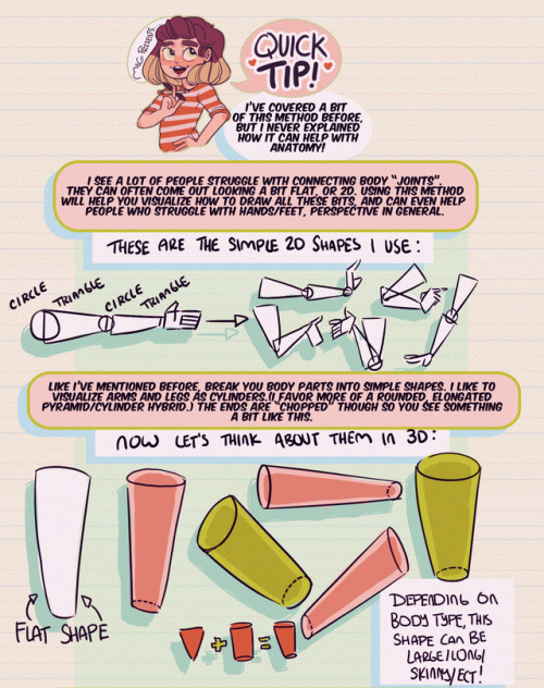
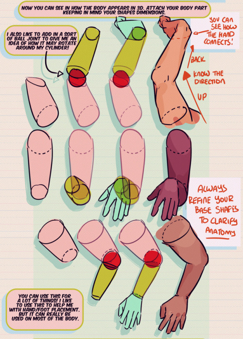
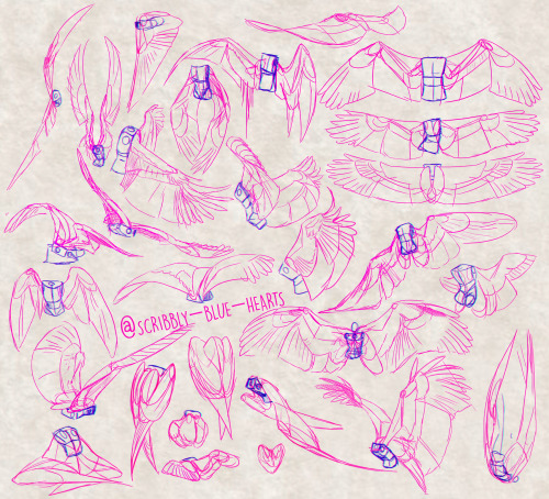
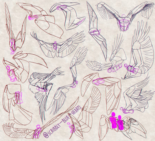
Hey friends!
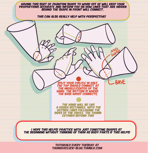
Meg here for this week’s TUTOR TUESDAY! This week I go over just a little trick that I like to use when drawing and connecting arms/hands/legs/feet ect. This helps me with foreshortening as well. I hope it helps you folks as well! I have tutorials that talk more specifically about hand/foot/leg anatomy here. If you have any tutorial recommendations send ‘em in here or my personal. Now go forth and I’ll see you next week!

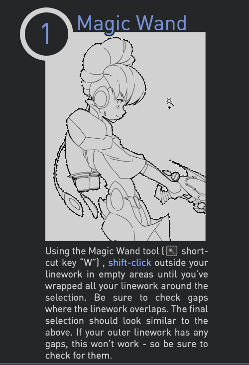
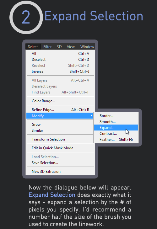
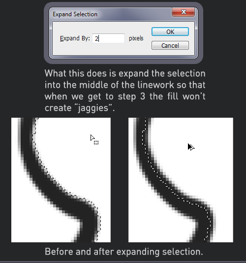

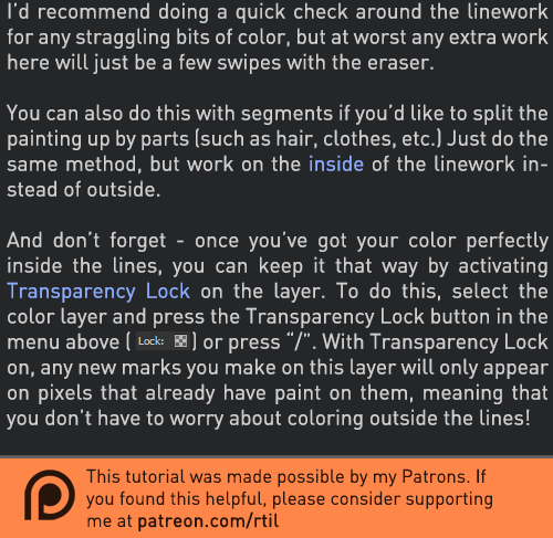
Late last year I wanted to start a series of short tutorials called Tip Jar, as a way of saying thanks to my fans and giving back to my patrons. This is the first of the series I have made, showing my technique on quickly filling in lineart so you can get to painting without coloring outside the lines faster.
Someday I hope to turn these into video tutorials when I have the income and the time, but for now I hope that I will be able to share useful tips in this infographic format.
Full tutorial image
Support me on Patreon
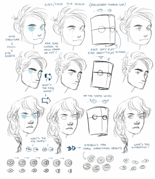
Anonymous said: I know you’ve shown how you draw faces from different angles very briefly before, but I was wondering if you’d ever go more in depth? For example, I always struggle with drawing the eyes at a ¾ angle… 😔
Ok, I get this question so many times that I decided to do something about it. I’ve already made a tutorial about drawing eyes and tbh it should help with drawing eyes from any angle, the tricky part is to understand the human face, its anatomy. If you see the face/head as a three dimentional object you’ll be able to draw it, I can’t say it enough, 3D thinking is important. Also, references are important, drawing from life is important because then you have a 3D model of the head right in a front of you. All you need to do is observe and understand.

-
 madokasoratsugu liked this · 1 month ago
 -
 alittlemadbutstillok liked this · 3 months ago
 -
 k4karma liked this · 5 months ago
 -
 sketchkobold liked this · 9 months ago
 -
 kalisarobot liked this · 1 year ago
 -
 doomboy911 liked this · 1 year ago
 -
 fraughtto reblogged this · 1 year ago
 -
 hiimsuperawkwarddontmindme liked this · 1 year ago
 -
 amiemiemie liked this · 1 year ago
 -
 conmepenonbuzz liked this · 1 year ago
 -
 adorable-bookworm liked this · 1 year ago
 -
 hellisnowlove liked this · 1 year ago
 -
 modarthelp reblogged this · 2 years ago
 -
modarthelp liked this · 2 years ago
-
 reference-edwardcollectsurns reblogged this · 2 years ago
 -
 zippiestrock liked this · 2 years ago
 -
 matidream liked this · 2 years ago
 -
 hazy-silence reblogged this · 2 years ago
 -
 dekuboy liked this · 2 years ago
 -
 bl00000g liked this · 3 years ago
 -
 chocobiko reblogged this · 3 years ago
 -
chocobiko liked this · 3 years ago
-
 vanillamichi liked this · 3 years ago
 -
 varezhkova liked this · 3 years ago
 -
 specialar liked this · 3 years ago
 -
 nikymerii reblogged this · 3 years ago
 -
 chelsychacon reblogged this · 3 years ago
 -
 yuugisbarber liked this · 3 years ago
 -
 okills liked this · 3 years ago
 -
 idiotbrains liked this · 3 years ago
 -
 selkietutorials reblogged this · 3 years ago
