I Just Found This Website That Can Randomly Generate A Continent For You!! This Is Great For Fantasy
i just found this website that can randomly generate a continent for you!! this is great for fantasy writers

plus, you can look at it in 3d!

theres a lot of viewing options and other things! theres an option on-site to take a screenshot, so you don’t have to have a program for that!
you can view it here!
More Posts from Artrefforsteph and Others
Hi! I love your art of various fanlands and i was wondering, would you ever do a tutorial on how you draw them or the process of how you draw them? Or perhaps have any tip or tricks?
sure.
there are certain things/tricks I do almost every time, so here we go.
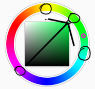
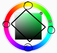
pick colors for the sky and the ground.

Keep reading


HIIRAREFS: Basic and Intermidiate guide to colouring in
What better day to end the year then with a basic guide to colouring- This is for beginners or intermediate artists. Colouring is a big part to an art piece, whether you decide to use colours or not, that’s up to you, but for the most part, having some knowledge on appliance of colour will really help you out!
____________________________________________
ARTISTS WITH AN INSPIRING KNOWLEDGE OF COLOUR APPLICATION! Please take the time to have a look at other artists work so that you ca research and get inspired!
Gullacass: Uses brights, dulls and pastels to create brilliant guro, pop and macabre pieces| DA + TUMBLR
TinyCalcium: Old friend of mine who explores brights and mustard colours and places them as a foundation for their work | TUMBLR
BeastPop: Talented with opposing and Triwheel colours. Outstanding cell-shading, and knows how to flexibly bend colour form to their will in popart. | DA
H0stel: Fantastic composition of light direction and applies colour to bodies based on ambient occlusion. | TUMBLR
_____________________________________________
COLOUR SLANG: I use some strange slang to express colour types and shades as well as groups. Although they may not be canonically correct, I will use these terms to describe colour palates to the best of my ability! Analogous: Colours that are near or adjacent to each other on the colour wheel, EG: Red and Orange
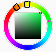
Oppositional/complimentary: Colours that are opposed or opposite from each other on the colour wheel, EG: Cherry and Green
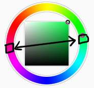
Triadic: Colours that form a triangle on the Colour wheel, EG: Cyan, Magenta and Yellow. These three colours when mixed together will make black.
Arrowtype/Quadcolour: Four colours, that generally form an arrow shape on the colour wheel.
Tetradic: Colours that form a rectangle or square in the colour wheel
Neons: The very brightest you can get a colour, be careful where you use them as they can look ugly together at the most. Try to use neons when you are adding bright glowing objects to your piece. Neons are great for highlights.

Brights: Slightly washed Neons. Appropriate if you have characters that are colourful.

Washed: Very washed brights with a hint of grey. These are also useful for colourful characters.

Pastels: Colour with white in them to make them seem light.
Baby Pastel: Pastel with even more white in them, good for subtle highlights.

Darks: Colour with black added to them. Used mostly for lineart.

Mustards: Colours with dark grey added to them

Earthen: Colours with brown added to them

Warm and Cool colours: Warm colours are colours that range fromMagenta to Yellow. Cool ones range from Lime to Fuchsia.

Straight tones: A greyscale palate. or a straight scale of one colour from black to it’s neon form.

Warm and cool tones: Warm tones are a greyscale mixed with warm colours and cool tones are greyscale mixed with cool colours.

Skintones: Warm washed or pastel colours generally used to colour in skin, but they don’t have to be warm at all! ( I will not show you a palate for this however)
______________________________________________
WHAT TO AVOID WHEN COLOURING: beginner artists, tend to go ahead and start by colouring their line art with neon and mustard colours. Neons are not necessarily good for base colours unless the character has a glow.

I often see lazy attempts to shade, often a beginner artist with use an airbrush and use black and white to shade and highlight their piece. This is not very effective, and I’m sorry to say… It’s kind of gross as well. Try to avoid being lazy. If you have a piece that has bold black lines, avoid using soft shading and airbrushing at this point of time.

Black and white isn’t always the best option when colouring in your piece, but it also depends on the style you are trying to convey. If you plan on only using straight tones to colour in a piece, black and white is good.

A GOOD BASIC WAY TO COLOUR For this basic tutorial I will show you a nice way to colour in a piece with bold lines. I will be using Minty’s Classic character as an example.
Begin with using brights that have been washed down a little and washed skin tones if your character is human based. Avoid using neons or mustards if you are able. If there is white on the character, such as the white on an eyeball or the teeth, consider using baby pastels. For Minty’s eyeballs I have used a baby pastel blue. I have chosen to use a darker and more washed version for her Irises.

With you foundation colours placed down, use a washed warm colour for the skin tone, such as a salmon. If the character’s hair or fur is warm coloured, use a pink or red orange to shade that as well. Use the cell shading technique. This may mean you will have to erase some of your shading so be sure to do this on another layer. For your baby pastels, you can use a regular pastel to shade it. For Minty’s eyes I have used pastel blue and lowered the opacity by a little.

For Highlights, I have chosen to use baby pastel yellow. I wanted the piece to be warm.

Applying a light airbrush over the top of the piece makes it feel a little softer. I have also applied the airbrush over the initial borders to create colour bleed, giving a very subtle reflective approach.

Colouring your line art layer, particularly if you have bold lines, can really make a piece look more interesting! I like to leave the overall outline black. You can gradient and bleed colour in your line art as well

Light tracing is a technique lots of artist’s use, where they run a sharp line of highlight next to line art to divide borders.

This looks a lot nicer than the black and white shading, doesn’t it!? __________________________________________
This is a very very simple guide to applying colour to your piece! If This helped, please reblog and share this guide around!
If you have any questions or feedback, don’t be afraid to send me a message!


SenshiStock
RomanceBacBat

SenshiStock is a collection of non-nude, figure model drawing references.
There are over 2000 FREE pose references on on DeviantArt.
SenshiStock.com has some merch & themed download packs for purchase.
There is a free web sketch app that also works on mobile. There are over 1500 images in rotations with optional tags and timer.
There is a SenshiStock Patreon for supporting the creator in exchange for more pose reference goodies.
—DeviantArt Gallery Shortcuts— General Drawing Poses Foreshortening or Perspective Poses Dynamic Flying Falling Action Poses Male Poses Gun Poses Staff Weapon Poses Ax, Hammer, Bat Poses Sword Poses Small Blade Poses Archery Poses Sailor Guardian and Magical Girl Poses Romance or Couples Poses Sitting and Kneeling Poses Dramatic and Reaching Poses Magic & Hogwarts Poses Defeated or Lying Poses Dance and Performance Poses Back Poses Pin Up Inspired Poses Life In General Poses Fights and Fighting Poses Leaning Poses Pairs Poses Wings Poses Hanging Poses Groups of Three or More Poses Instrument Poses Mirror Poses Pregnancy Poses

Chaos Angel - Submitted by Istoki
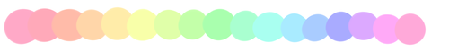
#F8E0C8 #F8B9B0 #EE7FA0 #9148B1 #3D3C75
Image Source
REFERENCE MASTERPOST WOAH
text tricks; click the <html> button in the corner

<small> makes things smaller. the more <small> you use, the smaller it gets.
<big> same applies with big
<sup> makes things go up up up up
<sub> makes things go down down down down
<u> makes underlines (only seen on blog pages)
go here for spacy wacey words
z̗̟̻̫̼͓͂ã̤̬͓̼͓̔̐̇͑ͩ̀l̯̜̰͐̒ͪg̺͎͈̍o͍̫̬̤ͭ ͍ͩͤ̈́a͇̘͙̼̠̪̣ͨ̾̍̿k̼ͣa̯̮͇̟ͫ̑ͤͭ̔̊ͣͅ ͌͆s̮̫̼͖̫̖̐̆ͦc̎ͪÃ͔̬̘̫̣̮̮̂̉͗R̈́Ẏ̖͕͚̱̩̠ ̫̝͎̞͖̄T͔̎͊̍ͪ̔E̲̞̽ͨ̿̑X͓̜̩̖̜ͦ͊T̹̥̰̊̎͂ found here
here and here for ƒαηcу/սռﻨƈօժε †εχ† (☞ here for unicode symbols ☜)
upside down text? oɯəlqoɹd ou
of course, those are the basics. <code> makes things monospaced and <pre> puts your text in a grey box.
other;
need themes? NEED THEMES? HERE’S A THEME REC W/ 4000+ THEMES AHHHHHH
japanese emoticons? (◕△◕✿)
things that look like japanese emoticons but are cute lil gifs?
anything else you need help with? a blog full of tutorials just for all the sweeties out there!!!!!

-
 thatfluffymuffin reblogged this · 1 month ago
 -
 thehuntshowdown-1fan liked this · 1 month ago
 -
 chancellorcannoli reblogged this · 1 month ago
 -
 sand-sandwich liked this · 1 month ago
 -
 dawnraysdigger reblogged this · 2 months ago
 -
dawnraysdigger reblogged this · 2 months ago
-
 youreputtingrootsinmydreamland reblogged this · 2 months ago
 -
 cloudhillshaze liked this · 2 months ago
 -
 tetsuro--kuroo reblogged this · 2 months ago
 -
 llixulia liked this · 3 months ago
 -
 acookiedragonblog reblogged this · 3 months ago
 -
 tsaaa liked this · 3 months ago
 -
 sunshinefirefox liked this · 3 months ago
 -
 raggymuffin reblogged this · 3 months ago
 -
 fishiepuff reblogged this · 3 months ago
 -
 dogs-with-lightsabers reblogged this · 3 months ago
 -
dogs-with-lightsabers liked this · 3 months ago
-
 himynameisjesyblue liked this · 3 months ago
 -
harmacistuff reblogged this · 4 months ago
-
 rainyaro liked this · 4 months ago
 -
 isumichi reblogged this · 4 months ago
 -
 oats-temp reblogged this · 4 months ago
 -
 merlange liked this · 4 months ago
 -
 ktags liked this · 4 months ago
 -
 bonniekf8-blog liked this · 4 months ago
 -
 uhuh100 liked this · 4 months ago
 -
 impossiblyshynerd reblogged this · 4 months ago
 -
impossiblyshynerd liked this · 4 months ago
-
 shirley-fizz-grenadine reblogged this · 4 months ago
 -
shirley-fizz-grenadine liked this · 4 months ago
-
 grei101 liked this · 4 months ago
 -
 wizardsgirl25 reblogged this · 4 months ago
 -
wizardsgirl25 liked this · 4 months ago
-
 hiddenbyfaeries reblogged this · 4 months ago
 -
 oasislake76 reblogged this · 4 months ago
 -
oasislake76 liked this · 4 months ago
-
 lillkogobean reblogged this · 4 months ago
 -
 lizard-on-a-windowpane liked this · 4 months ago
 -
 definitelynotmicheal liked this · 4 months ago
 -
geekinglikeaboss reblogged this · 4 months ago
-
geekinglikeaboss liked this · 4 months ago
-
 voidwolfmilf reblogged this · 4 months ago
 -
 the-wolf-fiendling reblogged this · 4 months ago
 -
 scifi-they-wrote liked this · 4 months ago
 -
 happyflowerdefender reblogged this · 4 months ago
 -
 changelingfangs reblogged this · 4 months ago
 -
 noxernia reblogged this · 4 months ago
 -
 fearless-stormclaw liked this · 4 months ago
 -
 sparapansena liked this · 4 months ago
NSFW because there will probably be nude refs | this is a side blog to sort all of the art stuff I need | none of it is mine
151 posts